Epson 2100 user report
With the purchase of the 2100 I intended to move across to a proper workflow of colour management for all my colour and black and white work. This has proved more complex than I had anticipated, but ultimately has delivered the quality of output I had hoped for.
Then you find the first annoyance with the printer. Epson haven't supplied any printed manuals for it, there's just a sheet of paper giving the very basics of installation. This might not matter too much for most printers, but the 2100 has a lot of options and the grey balancer software is quite complex. Wading through HTML help files and PDF files is no substitute for proper printed manuals.
However the printer is easy enough to get started with once you've got all the packing off, ink carts are easy to install, connection via Firewire and USB worked fine (with no apparent differences in printing speeds). The next hurdle is the initial set up. This takes some time needing several passes of paper through the machine at different settings. Epson fail to mention that it's actually important to use decent photo quality paper for the alignment checks as the test patches are so subtly different the differences won't be seen on ordinary office printing paper.
Again the documentation supplied isn't as good as it should be for a printer of this class. There really needs to be a good explanation of how to set up colour management, but those details are left to be discovered scattered about Epson's various global web sites. Maybe that's a deliberate policy though as no decent profiles were installed by the installation anyway.
Once the correct profiles are found, downloaded and installed the next problem for the CM beginner is making sure the printing software (in my case Photoshop 7) and the driver are set correctly to make best use of them. It's embarrassingly easy to make the mistake of setting a printer profile in Photoshop and then failing to ensure the driver is set to "No colour adjustment" in the advanced driver setting options. This has the result of applying the profile correction twice and giving dreadful results. However once CM is understood and used correctly the printer will deliver really good accurate results.
The supplied profiles form Epson Europe's site work excellently for their intended papers. Various people have made their own profiles available for the printer since it was first released, some of these were(are?) very good and provided a useful alternative to those Epson supply. Sadly in 2003 most of these profiles have had to be withdrawn from free distribution due to the licensing restrictions within the profile creation software.
Which is best may depend on what subject matter you print, so some experimentation may be worthwhile. I'm happy with the default Epson profiles myself and will stick with those for now.
It's worth mentioning that there is a "standard" profile, not specific to a particular paper type, supplied with the default installation that seems pretty dire. AVOID.
A few other third party paper suppliers also now offer custom profiles for their paper like Konica, Ilford and Tetenal, hopefully more makers will follow suit in time.
Ilford have even gone as far as offering a complete replacement printer driver for their papers they claim are suitable for the 2100. It works pretty well, but their claim that bronzing(an issue referred to later) isn't an issue with this driver doesn't hold up in my opinion. Not really worth bothering with I'm afraid.
An extra point worth noting is that profiles need to match not only paper type, but also ink type. The 2100 is unique amongst desktop printers in having more than one choice of ink type available for the "black" position. Photo Black which works for all paper surfaces and Matte black which is designed to give extra performance on Matte papers.
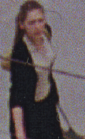
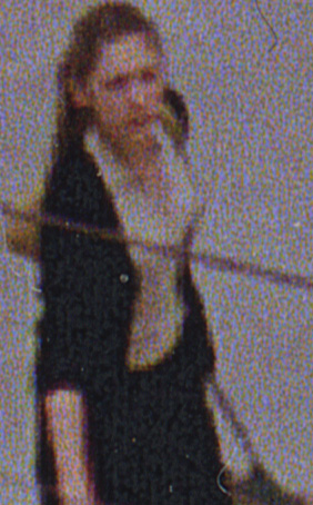
Whilst difficult to photograph, I hope this picture gives some idea of how the bronzing issue looks in practice. Print made on Epson Premium gloss paper.
The most contentious issue surrounding the 2100's performance is the results on gloss paper. The Ultrachrome inks really aren't too good on gloss surfaces at all. The ink appears to sit on the surface of the print and dull the paper's shine, usually referred to as bronzing. The main culprit is the photo black ink which sits on the paper very solidly. Bronzing is actually a bit of a misnomer though as the ink still looks black, not bronze, but the ink does dull the shine on all glossy papers. When solid blacks are next to paper base white it really doesn't look too good from some angles, as the picture on the left shows. This happens to a greater or lesser extent on all the shiny papers I've tried. Epson Premium glossy photo paper suffers very badly, Epson photo paper simply looks dead, Epson premium semi-gloss isn't too bad, nor is Fuji's premium glossy inkjet paper or Ilford's Gallerie smooth gloss paper. There are some reports on the web that Pictorico papers and hi-gloss film are not subject to this effect, but in my experience is untrue, the paper is little better than Epson's own offerings. The best bet for gloss output I've found so far is Konica QP(helped by their supplied custom paper profile) which isn't too bad at all and has the advantage of the brightest white paper base of any of the papers I've tried.
Whilst that might sound a pretty damning judgement on the prints, it isn't quite as bad as it sounds. Prints that don't have any significant areas of pure black or little paper base white showing don't show the effect to a noticeable degree. Most prints might look a little different if passed around and looked at from odd angles, but when mounted and framed the bronzing issue is hardly noticeable and the other good qualities of the prints shine through.
Where the 2100 really starts to deliver is on matte papers. I'll say now I was no great fan of matte papers until I tried the 2100, I needed a lot of convincing. However prints made on Epson Archival Matte paper are simply gorgeous. Good colour saturation, bitingly sharp, almost luminous highlights and are capable of a wonderfully subtle tonal range. If you use the matte black ink there is an added depth and improved shadow separation that is really excellent. One of the good features of the printer is that it is possible to change ink carts at any time and then replace them, so switching from matte to photo black isn't restricted to just when carts become empty. The printer automatically detects the different cart and discharges the head of old ink and primes with the new colour. It wastes a fair bit of ink in the process, but a useful feature never the less.
I like matte prints now, a lot.
In practice the reservations about how the prints look with respect to bronzing are the same in B&W as they are for colour. There is also the added issue of metamerism though. The Ultrachrome inks still suffer metamerism (colour shifts when viewed in different light) but not as badly as Epson's dye based inks. To get round this Epson supply the Grey Balancer software. Basically this prints out test sheets of different greys which you match to a reference grey sheet supplied, pop the figures into the software and bingo you have a custom adjustment for your exact printer/paper/ink/lighting condition. Sounds easy huh ? If only.
There are three problems surrounding this, apart from the previously mentioned poor documentation of which the grey balancer's is the worst example.
Firstly, patience.
The inks shift colour slightly as they dry, so you need to leave the inks for a long while until they are stable enough to make judgement on. At least an hour at the bare minimum, overnight is better. So you can see it's not a quick process.
Secondly, colour vision.
Anyone who has attempted to do colour printing at home will know that making accurate colour assessments is quite a skill, especially when the colour differences between the grey patches is very slight. It's also vital to always do this in the same lighting condition as the prints will be viewed in too.
Once those two steps are complete it's possible to make some really good adjustment files that work really well and give good looking B&W prints, so where's the third problem ?
Thirdly, where it's set.
The Grey Balancer software is completely separate from both the image manipulation software (eg Photoshop) and the printer driver. This means it's rather too easy to forget you have an active GB adjustment and start printing in colour and find you get odd colour casts. The adjustment is active even if the GB program hasn't been run on the computer that session. It's best to think of it as making invisible changes to the printer driver every time it's run. Checking the GB software has to become routine before every printing session. There have been many people caught out with this problem.
Epson really need to integrate the GB software into the printer driver so it's less easy to overlook.
The only downside is that the paper is very tightly wound and getting rid of that curl is nigh impossible, not a problem if the prints are to be mounted, but it's not as easy way of making lots of small prints as Epson might think.
Awkward to set up, poor results(very poor colour saturation) even with the correct CDRs. Try printing on CD without the correct coating and the ink never dries.
One good feature is that changing carts in the middle of making a print is possible and leaves no indication that printing was interrupted. I was impressed the first time I did it.
Other than that the only problem I've had in use is with the spooling performance with the printer. Occasionally if spooled, rather than printing direct, parts of the image are omitted. This may well be a problem with my operating system Windows 2000, rather than the printer software though as there are few other reports of this.